Sparklines shows the trend in the data.

Example:
State: CA
Years: 2006, 2009, 2011
Industry: Camera and photographic supplies stores
Annual Payroll has been declined over these years from 51M to 40M.
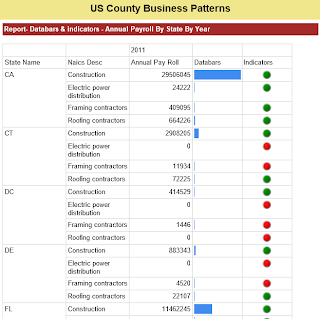
Databars are small graphs which can be included in each row to display the quantitative value in a horizontal fashion
Indicators shows the values in a range (Start and End values)

Example:
State: CA
Years: 2006, 2009, 2011
Industry: Camera and photographic supplies stores
Annual Payroll has been declined over these years from 51M to 40M.
Databars are small graphs which can be included in each row to display the quantitative value in a horizontal fashion
Indicators shows the values in a range (Start and End values)

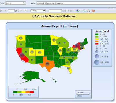
Maps - we can superimpose the values on to United States - "States"
We are using US Maps to display the Annual Payroll (in millions) for a particular Year and Industry.
.
NOTE: Values are being represented as 'Bubbles' on States.
NOTE: Values are being represented as 'Bubbles' on States.

Here is the video showing the Sparklines, Databars, Indicators and Maps:
No comments:
Post a Comment